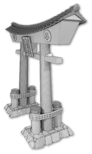
3d-printable terrain for all your samurai wargaming needs


| << Printing the samurai pond(s) 2019-08-01 | Samurai Pond available NOW! >> 2019-08-04 |
Phew! Finally done! As a painting project, there was a lot to do here. There are so many different ways (many better, of course), but here's a painting diary of how I painted up the 2 new Samurai Ponds over the last two days......
* Incidentally, I would recommend printing the pond at 0.1mm layers, if you have the time! I printed these at 0.2mm layers (because they were prototypes, essentially) and some of the rocks have quite shallow sloped top surfaces - which, as you can see, would have looked better with a finer print resolution! So please excuse my print lines!! ˜³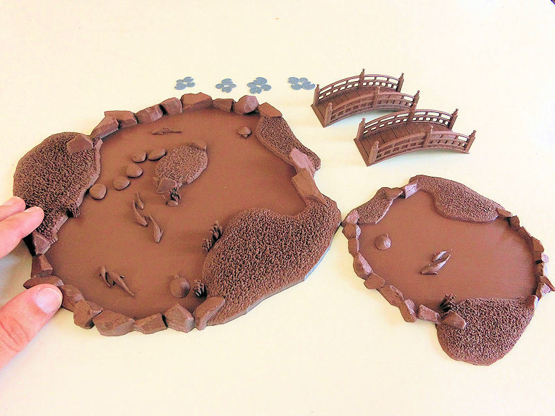
£ First step was to glue down all the accessories, except the lily pads, and undercoat everything. I had half a spray can of this lovely chocolate brown in the cupboard. �
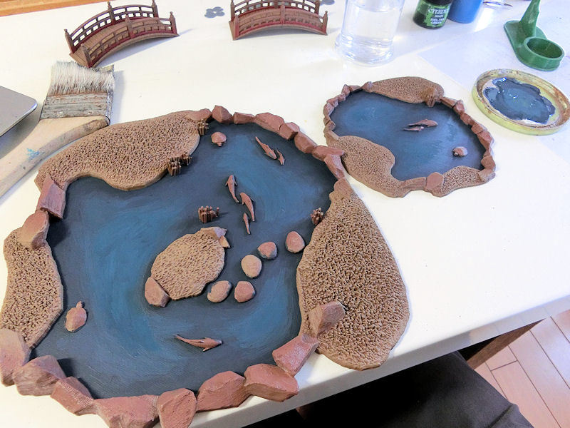
£ After a messy drybrush of lighter brown over the earth areas, I decided to tackle the water. Looking at real life photos of ponds, a green would have probably been more realistic, but my terrain rivers are already done in blue, so I went with a dark blue, and would try to add some green tinted water on top later.
Starting with a midnight blue to basecoat the water areas, I slowly mixed in a medium blue bit by bit, and used that mix to fill in some of the wider areas. Again, if you wanted it to look realistic, you should probably do the opposite - paint it lighter towards to shallower edges, and darker in the deeper areas. I'm compromising with what's easier to paint!
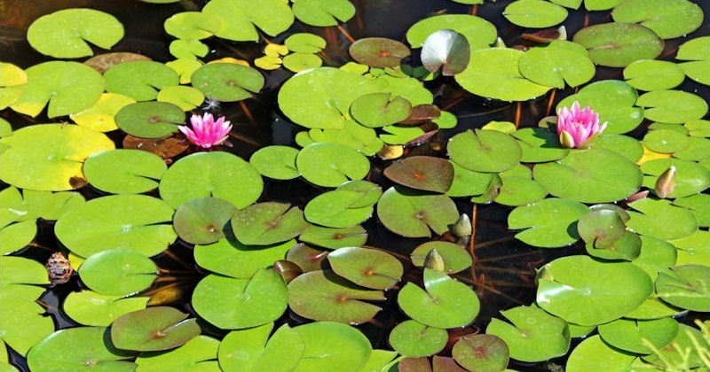
£ Here's a reference photo of lily pads, to show that various shades of green work well together. After basecoating my lily pads in one shade of green, I realised that I really wanted to mix it up a little more, to prevent them looking too fake.
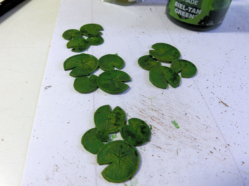
£ So using some messy drybrushes of lime greens and some splodges of green wash, I was happy enough with these variations.
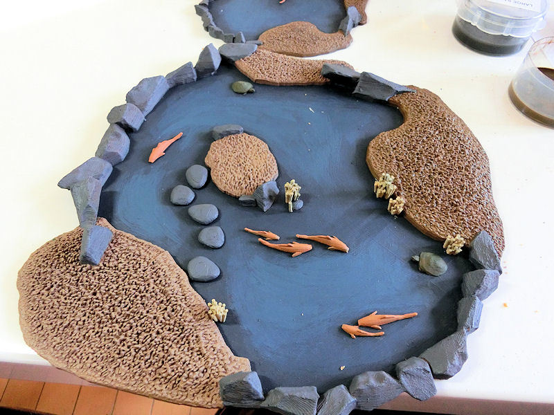
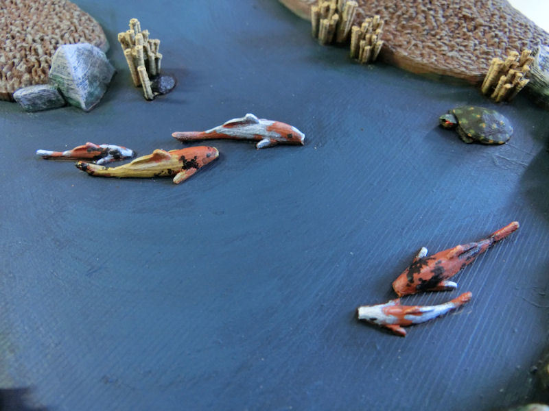
£ Adding basecoat colours to everything else was next, so it was sandy yellow for the reeds, orange for the koi carp, khaki green for the turtles and medium grey for the stones.
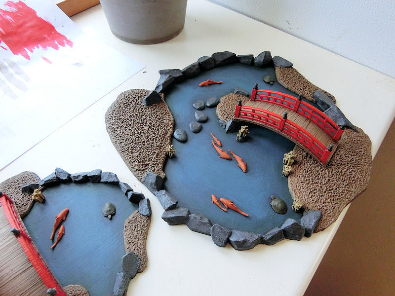
£ The bridges got their bright red railings and charadon granite (dark grey/brown) post caps, and then everything was treated to a heavy wash of either brown wash or black wash. The fish got a wash of orange, and the edges of the water areas were given a rough line of green wash to blend things together.

£ Animals were next, and I used this picture of a pond turtle as reference.....
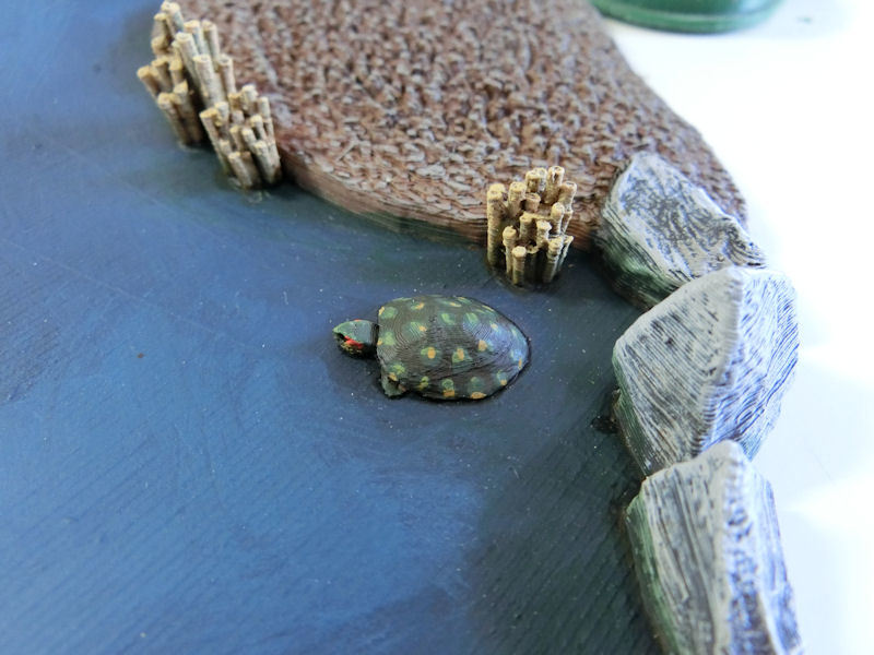
£ .... to paint this! Khaki green basecoat, brown wash, then slightly lighter green splodges around the edge of the shell, and a few small dots of sandy yellow on the edges. Finally, a streak of orange on each cheek.
To be honest, looking at this closeup photo, it looks very rough (and the rocks look even rougher), but it's zoomed way in. I'm hopeful it'll look fine at a player's view of about 30~50cm!
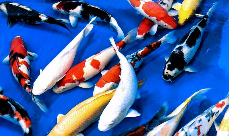
£ Koi carp were next, and again I would recommend getting a good reference photo to work from. The one colour missing from the photo above is black or dark grey. You get those in ponds too, but I didn't think that would work so well in photos, so I stuck with oranges and whites, mostly....
£ After the orange basecoat and onange wash, I added light grey patches to various fish and highlighted those with white. One lucky fish got that gorgeous gold colour (yellow!), and then all the fish got flecks of black mottling.
At this point I also painted the ninja with a simple black hood and a few dots of skin tone. His head will mostly be underwater anyway, so it wasn't too important.
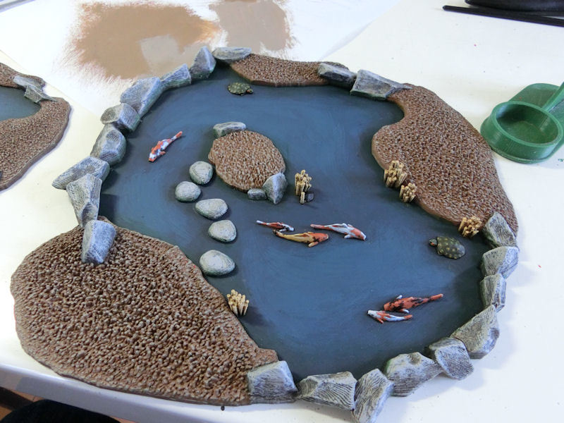
£ The final stage of painting was to messily scrape lightgrey over the rocks (like a very heavy drybrush) and then drybrush the earth areas and reeds with a flesh tone. Then a few more patches of brown wash on assorted rocks, and one more pass with green wash on the edges of the water.

£ Flocking onto pva glue was next, first with a darker green in a very few places....

£ ... and then more heavily with a lighter green.

£ After knocking off the excess flock, I dabbed patches of static grass onto various areas to give it more of a bumpy grass texture.
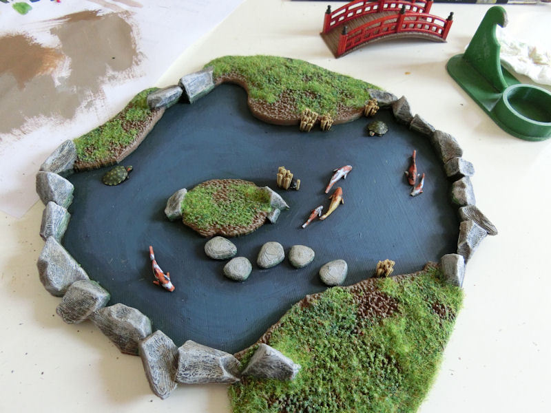
£ At this point, I could have called it "finished" and just added a coat of gloss varnish.
But, since the model is also designed to be watertight, I wanted to add a few millimetres of water effects to create a greater depth....
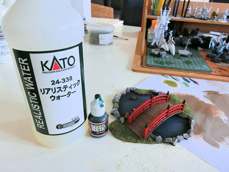
£ Yes, some of you older gamers might recognise this? It's some green ink from Games Workshop in the 80s, and I was happy to find it was still usable after 30 years!!!
So I added two drops of green ink to the last 5cm of my Realistic Water by Woodland Scenics, and gave it a swirl.
It looked like bright green mouthwash!!!! �
So I added a few drops of brown wash to calm it down, and carefully poured in a steady dribble of the mixture, first around the edges to ensure there were no gaps, and then the open areas to finish it off.
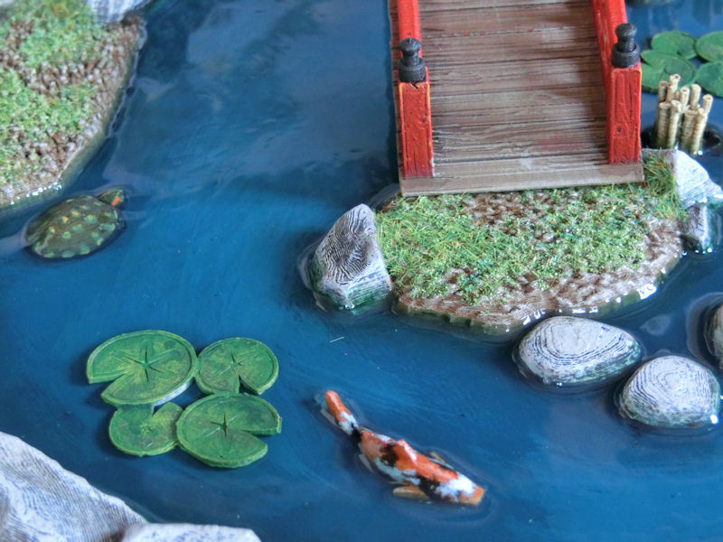
£ Ta-da!!! This was about 2mm of depth, but upon drying it shrinks slightly to about 2/3rds of the depth. Doh! So I will try adding another pour later, but for now I have run out of both Realistic Water and time!!
I guess it'll do for now, so you can see the 'finished' photos tomorrow for the official release!
| << Printing the samurai pond(s) 2019-08-01 | Samurai Pond available NOW! >> 2019-08-04 |